I recently did a demonstration with
Mid-CT Meetup Photography Group in conjunction with Russ Tokars. The premise was to show how two individuals handle the post processing of the same image. They asked their members to submit some photos they wanted to see processed then Russ and I would process them and explain our methods and the reasons for making those choices. Russ used Photoshop while I used Lightroom. The demonstration was a big success.
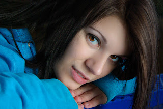
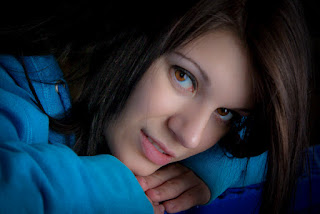 |
| Final processed image |
In this article I have selected one of the images that was supplied to us in order to give a step by step demonstration of how I tackled this particular image. I want to thank Mark Wright for the generous use of his image for this example. I also want to stress that this demonstration is my approach to this particular image and is not the only way to approach the problems presented. I also want to explain that although I will be talking about processing this image with Lightroom 3, the techniques can easily be done with similar tools in other editing programs. Finally, the finished look is not necessarily the best or only way to process this image. Feel free to experiment.
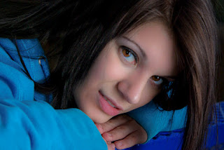
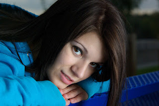 |
| Original image |
The first thing I do when I approach an image for processing is to look for obvious flaws. Sometimes they are very evident, other times a bit more subtle. To the left is the original image Mark sent me. At first glance you see a well exposed portrait of a beautiful woman. Once you start looking for problems we see that the first issue is the central location of the subject. While there is no rule that dictates you have to use the rule of thirds, in this case there is too much open area to the right and we get distracted by all that blurred out background. So my first step is to crop in closer, bringing the face into the forefront and getting it out of its central location.
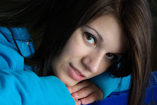 |
| Cropping |
As you can see, our attention is completely on her face with nothing else to distract us. This change, however, modified our tonal balance completely. We now have a 'hot spot' surrounded by a lot of dark. In one respect this is good as our eyes tend to go to the lightest part of an image first. However I feel the balance is not quite there. Part of this is because the contrast appears harsher once the face came to take up the frame. At this point I need to tackle the contrast on her face. I use Lightroom's brush tool and
burn setting to add shadow to the under side of her face, lower lip and hands. I also burned in some of the wrinkles of her sleeve.
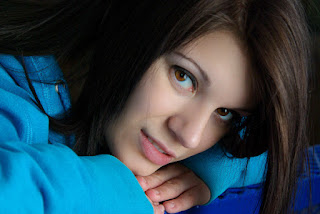
 |
| Tone adjust and burn select areas |
Next, I used Lightroom's brush tool set to
soften skin. I work around the eyes to blend out the skin tone a bit. I also use the brush tool with
iris enhancement to brighten up her eyes. If you look at the image at left you can see how much softer her expression appears. You will also notice how the skin was toned down and has a more natural looking glow. For that I used
highlight recovery on the image. The bridge of her nose and her forehead has lost that harsh contrast from the
highlight recovery. I'm very pleased so far but the face still needs a little more softening. After all, this is a portrait and we want her looking her fabulous best.
 |
| Soften around eyes |
Still using Lightroom's brush tool I brush over the entire face using the
soften skin built-in setting. Her face really glows now. Actually too much so in comparison with her hair at left. Squint your eyes a little and it looks like a mask just floating there. The hair on the right is great, lots of texture, good color.
I am still using the brush tool here but I am now going to bring some of the hair texture on the left with the dodge tool. This selectively lightens whatever I brush over. I brush in strokes following hair flow to keep it natural.
 |
| Skin softening and select burning |
At this reduced size for this example (and depending on your monitor) you may not notice the subtle change in her hair. Keep in mind that this is supposed to be the shadow side so I don't want to brighten it up and compete with the right side where the light comes in from. That wold loose the look and appear fake.
Note; this is a great example of broad lighting.
While the changes so far are getting me closer to what I'd like to see, there's still something off. I revisit the burning I did earlier to the hand and the shadows of the sleeve and reduced the exposure on it to darken the area. I also notice the back of her head is still too dark. Here I pushed the
fill light up just a touch. I want to add light to the dark areas without loosing control of the overall look.
 |
| Fine tuning, tone adjust, saturation |
With the added
fill light I also push my
blacks level up a few points. Just enough to reintroduce black into the shadows. You can now notice the texture to the back of her head, breaking up that solid field of darkness.
Up to this point we have only softened the face. The next step I take is to drop the
clarity on the entire image to soften it up just a touch. If you look at the next image you can see how much softer the whole image looks without loosing detail.
At this stage all the most obvious problems have been addressed, cropping, tone balance, skin softening, etc. I take some time to do some fine tuning on color, luminance and saturation. This stage can be frustrating to some since you can nit-pick until the cows come home. For example, something that I would do for a client that I didn't do here is clone out that stray hair falling across her face. In this stage I reduced
saturation a bit more, boosted the
tint to the blue side a touch and reduced
clarity some more, further softening the image.
One trend that comes in and out of fashion is the adding of a vignette. This is a nice simple technique to do in Lightroom. Under the
effects module you will see several sliders. The first one,
amount, controls both the density and the color (white or black) of the vignette. The remaining sliders modify aspects of the vignette.
The nice benefit of adding a vignette to an image is that it further helps pull the viewer's eye to the subject. As with any processing effect, the amount and density of the vignette heavily depends on the image. The wonderful thing about Lightroom is that you can move the sliders around until you find something that pleases you. A good vignette has to work with the subject, the background and the mood of the image.


Comments
Post a Comment
Post a comment only if it adds to the topic being discussed. Spam, hate or derogatory comments will not be allowed.