

With any lens there are considerations to keep in mind; focal length, angle of view and perspective are three that immediately come to mind and I'll cover some aspects that need to be understood in order to make an informed lens choice for a given scene. One suggested exercise is to take all your lenses, find a suitable subject and make a series of images with all the lenses in your collection. If you have a zoom lens, take several images at varying focal lengths so you have something for comparison.
For this exercise I went to a picturesque part of a neighboring town. In front of the library is a war memorial. Just a statue of a soldier on a pedestal, but the overall scene was perfect for this demonstration. The diagram below illustrates the area and explains the relation of the elements in the accompanying photos.

The subject, the statue, sits one third of the way into the scene (with the library as the background point). Visually, you will notice some images look as if the subject is much further away while others look as if the background is much closer. The 50mm is the only shot looking relatively similar to what I experienced.
This exercise lets you physically see how each of your lenses behaves. It builds your knowledge library for future reference allowing you to pre-visualize a particular scene and choose the appropriate lens. For this example, I decided to keep the same aperture setting for all my lenses just for standardization. I chose f/5.6 as that was the largest common denominator for all my apertures. You should consider doing a depth of field exercise in conjunction with this exercise. I'll discuss that in the next article.

One of the interesting things about viewing the resulting images in a group (above) is you can see the relationship of camera to subject / subject to background distances with varying lenses. This relationship is a result of the lens' focal length and the angle of view.
Focal Length refers to the point in which light rays, focused on infinity, come through a lens and converge on a focal point on the digital sensor. In a simple lens it is determined by the length of the barrel. In layman's terms, the further the focusing lens is from the sensor, the closer (or bigger) the subject appears to be to the camera.
With lens technology advancement, specially with variable focal length zoom lenses, the focal length is in reality an effective focal length. It's based on complex math I can't even begin to explain.
 The longer the focal length is, the tighter the field of vision within a scene is. Obviously the shorter the focal length is the more of the surroundings you are able to see. This is angle of view.
Angle of View is the area of the scene visible to the camera through a given lens. Keep in mind that a scene coming into a round lens projects a round image. Our sensors and viewfinders crop it into a rectangle. Picture a cone extending forward from your camera in all directions, the wider the cone, the more of your scene is visible. The smaller the cone, the narrower your scene, as shown in the illustration at left. (Note: some people also refer to this as Field of View)
Of all the aspects of a lens, these two are the foremost you should understand. When you approach your subject and start visualizing how you want to capture that subject, lens choice should be high on the list. However, two side effects of focal length and angle of view are compression and distortion and are directly tied to the mechanical properties of a lens.
Compression refers to how distance is perceived within an image. Keep in mind that a photograph takes a three dimensional space with height, width and distance and then flattens and shrinks it down to a convenient, digestible format for us to share. What we see as distance with our binocular vision in a 3D space is simply not available on a flat 2D image, making certain elements appear closer than in real space. That effect causes a visual illusion that will make some elements look to be closer than they are while other elements appear further away than they are. I'll explain that in a bit.
Another type of distortion common to cameras is perspective distortion. This is where straight parallel lines appear to converge. Think of those images of skyscrapers taken from ground level where the tops of the buildings appear to lean into each other, or the sides of buildings that should be straight up and down but look angled inward. This distortion is a result of mapping a subject that should be parallel with the camera's digital sensor but, for composition or practicality, can't. I'll explain that in a bit too.
One good thing about modern digital software is there are methods for correcting some of these optical distortions should you want to. Compression, on the other hand, not quite correctable.
Breaking down the issues
So far I have explained focal length and angle of view as well as described some issues associated with them, compression and distortion. Let's take a look at those issues from the photo shoot above. Let us first look at spatial distortions created by the various focal lengths. |
| Lens 120-400mm@ 300mm focal length |
In the image at right I chose a long focal length to bring the subject close in. The statue appears as if it is right in front of the viewer. In the background, aside from the blur, it appears that the building is a lot closer than it physically is. Had I chosen to shoot this scene at a smaller aperture (f/11 or f/16 for example) it would have really made the building seem like it's right on top of the figure rather than 100 feet away from it. The physical distance between the two has been visually reduced, or compressed, by the optical effect of the lens.
 |
| Lens 12-24mm @ 24mm focal length |
This image at left was taken with a really wide lens, causing both the statue and the building to appear extremely far away. In this shot it appears that background to subject distance is closer than the subject to camera distance. In other words, the statue and building appear as if they are close together and the camera is at a great distance. Remember, in actuality the opposite is true. Definitely an effect of the wide lens used to capture the scene.
 |
| Lens 24-70mm @ 50mm focal length |
This image was taken at a focal length (50mm) that comes the closest to what our natural eyes see, or what is referred to as a natural focal length or normal angle of view. At this focal length we clearly see that the statue resides closer to the camera than to the building. Had I shot this from a slightly higher angle, those distances would have been more noticeable.
Another way of looking at focal length relationships is by overlaying these three images over each other, at scale to the base image. Here is what I mean;

In this illustration I have superimposed each of the above images over the wide angle shot. You can see the relatively tighter and tighter shots as the focal length gets longer and longer. The base image was taken at 24mm, giving us a very wide view of the area. In the first inset image the focal length is at 50mm and you can see how much of the area is cropped out of the scene. The area seen by the lens is more selective. Finally the last inset image is at 300mm and it's so small, in relation to the base image, you can barely make it out.
Because each focal length effectively fills the sensor, the angle of views are noticeably different. Don't let these overlays fool you, it's not like the image size gets smaller. However, you can see how much of a scene is effectively cropped as the focal length gets longer and longer.
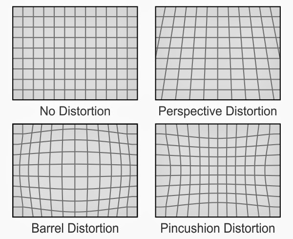
Distortion: Many wide angle lenses are notorious for barrel distortion. Fortunately, as mentioned, many of today's software come prepared for correcting this distortion. However, perspective distortion isn't as easily corrected, although it can be done in post processing with most major editors.
In the image below I have taken a portion of the wide angle view that best illustrates these types of distortion. I overlaid a grid to better show the amount of distortion this particular lens creates.

As you can see, the edges of the image creates an extreme angle in the upright parts of the building. Walls that should be straight up and down look like they are leaning away. This distortion is caused by both barrel distortion and perspective distortion. Barrel distortion because of the extremely wide angle of view and perspective distortion because the plane of the sensor was not perpendicular to the plane of the building walls. I had the camera lower to the ground and was shooting more in an upward position.
Another form of perspective distortion is occurring in this photo but, because you are not familiar with the scene, you may not be able to pick up on it right away even though it is rather extreme. That distortion is of the ground plane. To show you what I mean you'll have to scroll up to the map illustration above. Pay particular attention to the shape of the piece of property the statue is located on and compare it to how it looks in the photo. In particular, note the position of the camera and of the statue within that piece of property.

The physical property I am standing on forms a triangle. The two sides of that triangle diverge away from me at about a 30 degree angle. In the photograph, however, it almost appears as if the two streets on the sides run parallel to each other. Talk about a visual illusion.
To show this perspective distortion I have superimposed a square grid over the photograph in the same perspective as the image. You can see how the two side roads diverge away from the grid the further into the image you go. Had the two streets been parallel they would have matched the angle of the grid.
Conclusion
When choosing a lens keep in mind that the focal length will determine the angle of view. The greater your angle of view the more distortion that lens will introduce into your image. The smaller the angle of view the more compression of distance will be applied.Most lens distortions can be corrected in post processing but some distortions can add an artistic element to your photography. Knowing what kind of distortion to use and when to use it is part of understanding your equipment. The same goes for avoiding certain distortions.
If you enjoyed this article, feel free to offer your comments below.
Very informative and well explained article Duck, thank you!!
ReplyDelete